Perforce
Need: Perforce came to us to build a version-control file-management system for cross-functional teams. It had to support large file formats (graphics, video, 3D, you name it!) and integrate with Git so developers and creatives could work together seamlessly. The client’s end goal was a robust tool that would take years to fully develop.
Solution: Through user research we were able to prioritize the large amount of features and inform the roadmap. Within a few short months, we were able to release a functional beta.

Our first round of research enabled us to hone in on a specific target audience.
We learned that mid-sized game development shops are our ideal customer and user due to communication challenges, lack of formal processes around file sharing and the large file sizes they work with. These teams are often distributed and are in need of a tool that will organize their files and workload.


Next we learned that importing existing projects is key for driving adoption.
Initially we focused on (what we thought) were key features but we quickly learned that smooth on-boarding and importing existing projects was going to be essential for success.


In some cases, managing expectations is the most important thing.
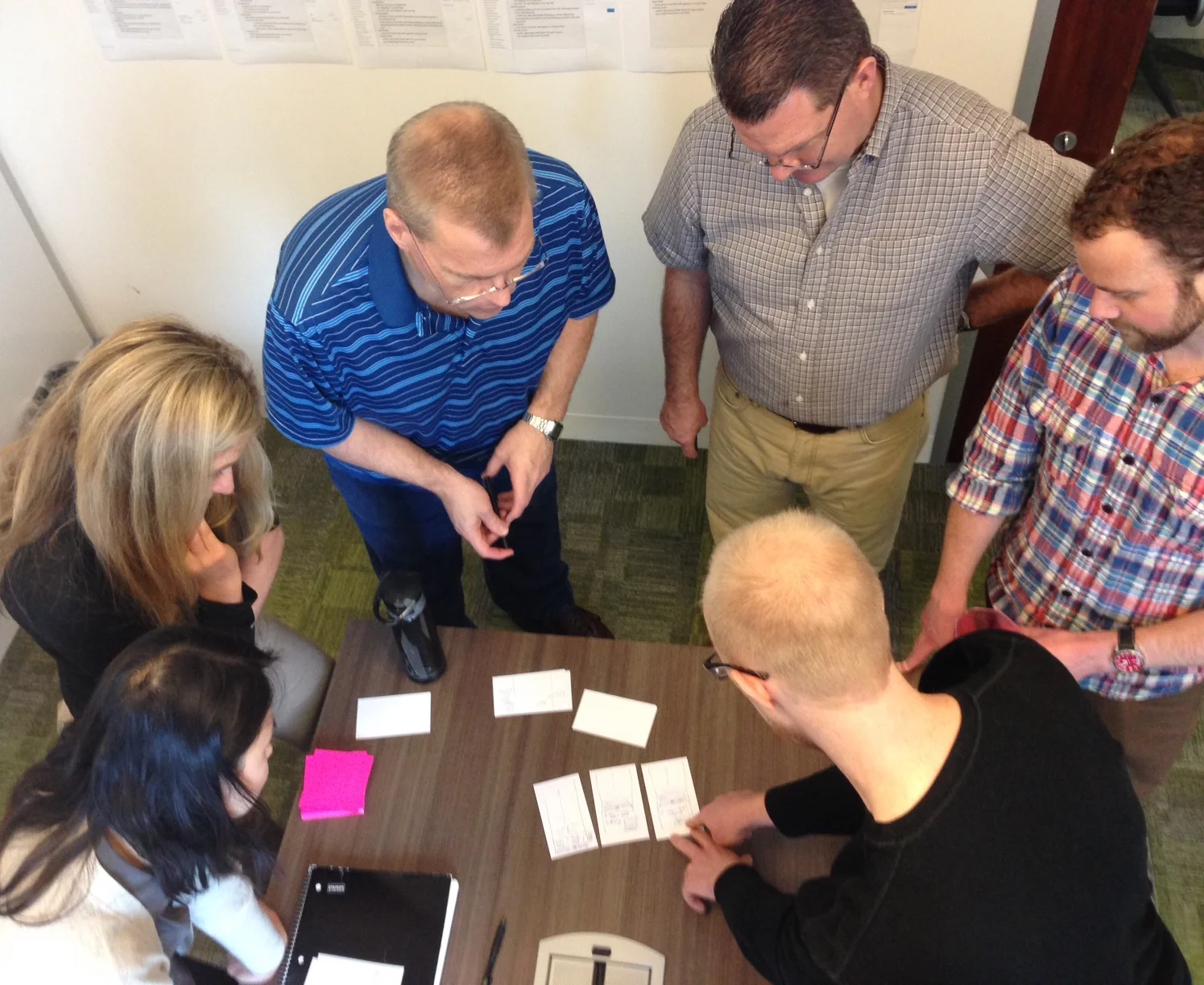
The Perforce team was involved in every step of the process. When working so closely with stakeholders it is important to set expectations early and often and give context while sharing half-baked design ideas. This is why we came up with our own design critique format, to ensure the conversation was focused and productive. After a couple weeks of working closely with the Perforce team, we were able to collaboratively sketch design solutions whenever we embarked on a new feature.
Designing a one-page-app is all about designing components and how they work together.
Once the overarching interaction model was established it was time to dive into all the actions a user could take within the single-page experience. Informed by our ongoing research, one by one, we added pieces of functionality to the tool.
Below are some of the things we considered when designing button groups:
We looked at many ways to organize the button-groups and how to handle the verbiage, experimenting with iconography, verbs and adjectives. The final design did not include icons to reduce ambiguity and focused on verbs as the call-to-action.
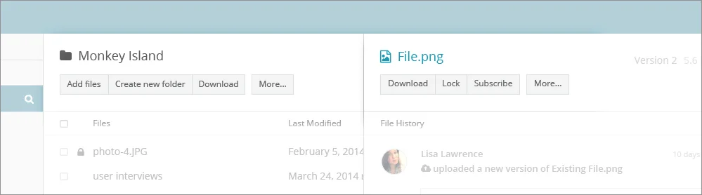
We identified the three most common actions for folders and files and tucked everything else under a “More…” button.
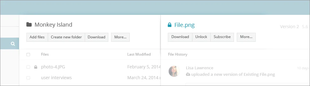
When a file or folder was locked the “Lock” button would change to read “Unlock” and the icon of that item reflected the locked state.
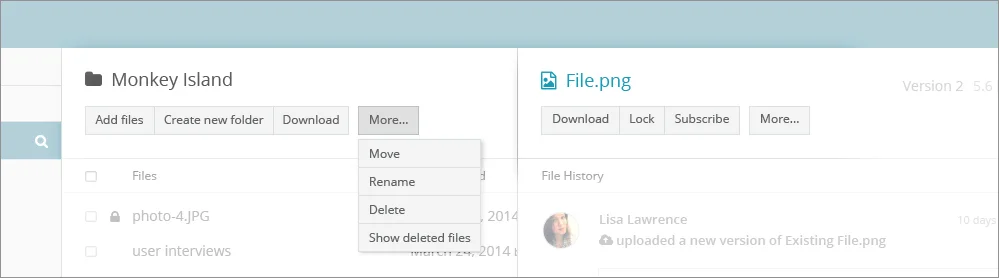
The “More…” button reviled a dropdown with additional actions.
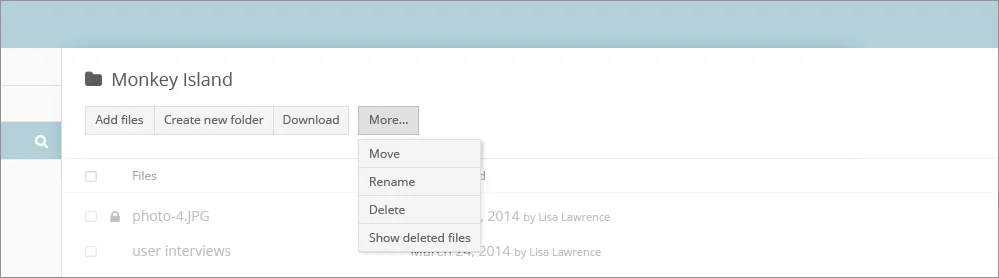
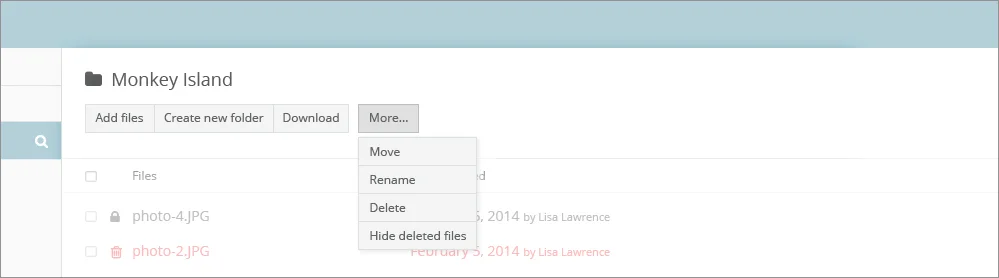
Based on user research we were able to determine which buttons can be tucked under the “More…” button.
We had a successful beta release before the client’s engagement ended.
Helix’s beta was released in time for a large gaming conference. We received positive feedback and lots of interest, the number of sign-ups far exceeded our expectations.